

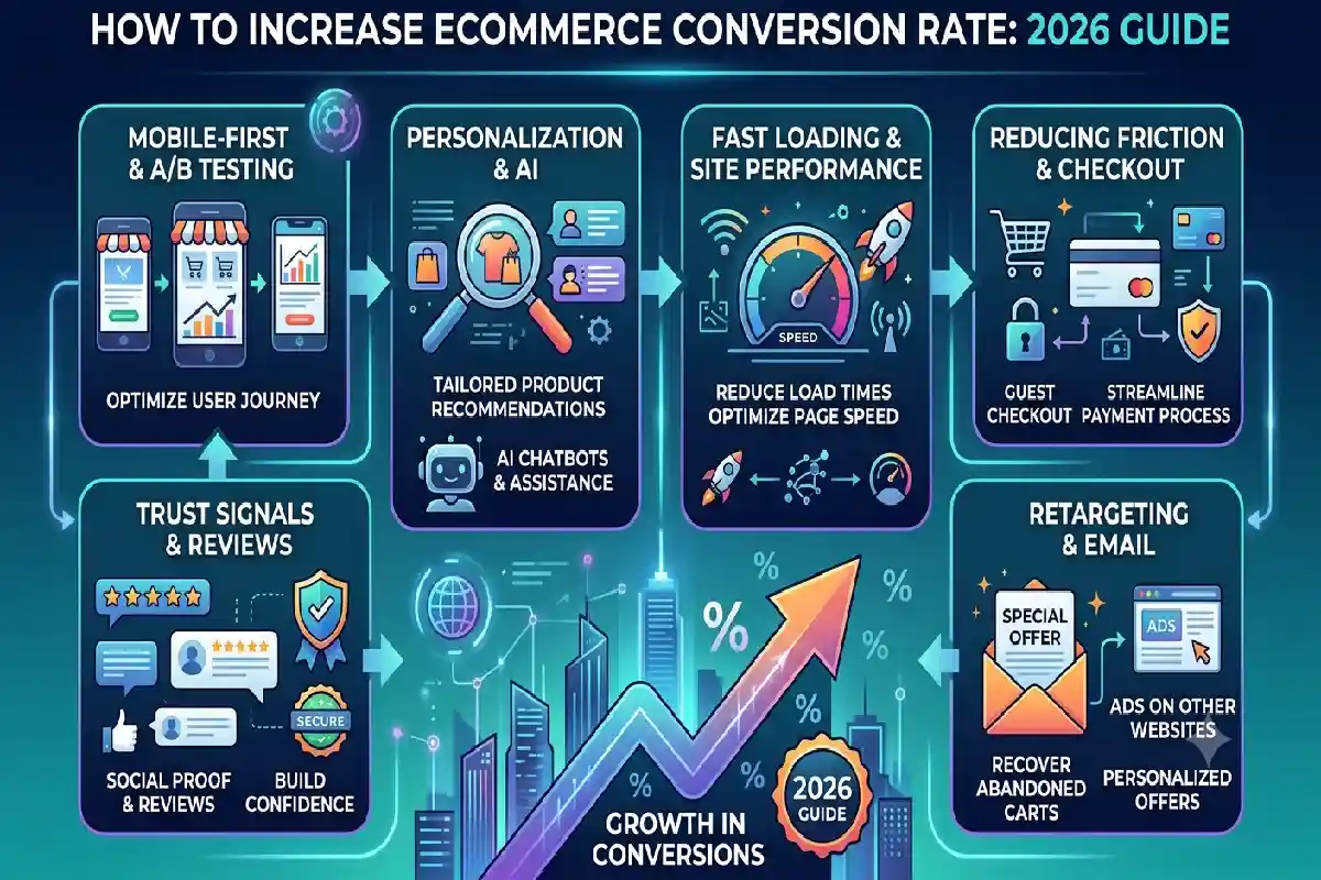
How to Increase Ecommerce Conversion Rate: 2026 Guide
Last Updated: September 13, 2026
Conversion Rate. So, to learn how to improve ecommerce conversion rate, begin addressing the dead ends of the entireshopping experience. More visitors do not necessarily translate into more sales, but higher conversion rates do. Focus on decreasing the drop out points of your ecommerce funnel and analyze the reasons for the abandonments, eliminating them accordingly.
There is not a single “good” ecommerce conversion rate in 2026. So far, the data we have seen present a wide range of results depending on traffic source, industry, device mix, average order value, measurement approach etc. A more recent analysis of 168 A/B tests reported a median site level conversion rate of 3.5%, with a normal range of circa 1.8 5.5:.
So instead of asking whether your store matches an industry average, ask a better question:
Where is your funnel losing qualified shoppers?
Why is Your Ecommerce Conversion Rate Low?
A low conversion rate usually isn’t caused by one problem. It is often the result of several small friction points throughout the buying journey.
Common causes include:
- Slow-loading pages
- Weak or unclear product descriptions
- Poor product photography
- Missing reviews
- Unclear shipping costs
- Complicated checkout
- Forced account creation
- Limited payment options
- Poor mobile UX
- Weak trust signals
- Difficult product discovery
Start with your analytics rather than redesigning the entire website.

Track at least these four stages:
| Funnel stage | What to monitor | Possible problem |
| Product view | Product-page engagement | Poor targeting or weak page |
| Add to cart | Add-to-cart rate | Product uncertainty |
| Checkout started | Cart-to-checkout rate | Price/shipping friction |
| Purchase | Checkout completion | Payment or checkout friction |
A 2026 CRO guidance from Clicks Geek suggests that you should review the funnel metrics (conversion rate, average order value, and cart abandonment) to determine if the funnel needs improvements before trying to make any design changes.
Practical tip: Save time by not editing your CTA color. If shoppers are dropping out due to unexpected high shipping charges late in checkout, they will ignore your new CTA color.
I would like to highlight a desirable attribute that I would bring to the team from my experience, based on what I have learned and observed so far. Under the right conditions, I am motivated and eager to learn new things. I am proactive and willing to take on the extra task in order to see the project succeed.
How to Improve Ecommerce Product Page Conversions
Product Page will be where shoppers will decide if they want to buy your product
A great converting product page will answer a customer‘s most pressing questions without them having to go looking for the answers.
1. Show the product clearly
Use:
- Multiple product angles
- Zoomable images
- Lifestyle photography
- Product videos where useful
- Images showing scale or dimensions
- Variant-specific images
Baymard reports that 56% of users immediately explore product images after arriving on an ecommerce product page, while only around 25% of ecommerce sites provide sufficient imagery for proper product evaluation.
2. Write benefit-focused product copy
Don’t only describe what the product has. Explain what the customer gets.
Weak:
“20-liter waterproof backpack.”
Better:
“Keep your laptop and weekend essentials protected with a lightweight 20-liter waterproof backpack.”
Use a short benefit summary near the top, followed by detailed specifications further down the page.
3. Put reviews close to the buying decision
Display:
★★★★★ 4.8 | 1,247 reviews
rather than hiding reviews at the bottom.
Baymard’s testing found that as many as 95% of subjects relied on reviews when evaluating products.
Also include customer photos, verified-purchase labels and review filtering when appropriate.
4. Remove purchase uncertainty
Place important information near the CTA:
- Delivery estimate
- Shipping cost
- Return policy
- Warranty
- Payment options
- Stock status
- Size guide
Shopify’s 2026 product-page guidance similarly emphasizes imagery, descriptions, reviews, CTA visibility, variants and mobile usability as core optimization areas.
How to Reduce Friction in the Buying Journey
Every unnecessary step creates another opportunity for a shopper to leave.
Make pricing transparent
Don’t surprise customers with shipping fees or additional charges at the final stage.
Show:
Product price + shipping information + estimated delivery
as early as reasonably possible.
Offer guest checkout
Don’t make customers create an account simply to purchase.
You can offer account creation after the order is completed.
Reduce unnecessary checkout fields
Baymard’s latest checkout research found that the average checkout contains 11.8 form fields, while many checkouts can function with around eight.
Remove fields you don’t actually need.
For example, don’t ask for:
- Company name
- Separate billing address when unnecessary
- Optional demographic information
- Account password before purchase
Offer convenient payment options
Depending on your market, consider:
- Cards
- Digital wallets
- UPI
- Buy now, pay later
- Express checkout
- Local payment methods
For Shopify merchants, Shopify reports that Shop Pay can substantially improve lower-funnel conversion compared with conventional guest checkout, although results vary by store and customer mix.
Mobile Ecommerce Conversion Rate Optimization
Mobile shoppers should not have to fight your website.
Check the complete purchase journey on an actual phone:
Landing page → product page → variant selection → cart → checkout → payment
Look for:
- Tiny buttons
- Slow-loading images
- Intrusive pop-ups
- Difficult menus
- Horizontal scrolling
- Hard-to-use filters
- Keyboard/input problems
- Payment errors
- CTA buttons that disappear while scrolling
Baymard’s research highlights mobile usability as a major ecommerce challenge and has conducted hundreds of mobile user-testing sessions to identify common problems.

Mobile CRO checklist
| Element | Better approach |
| CTA | Large and easy to tap |
| Images | Compressed but zoomable |
| Navigation | Simple categories + search |
| Checkout | Minimal fields |
| Payment | Mobile-friendly options |
| Product details | Scannable sections |
| Delivery | Show estimated date |
| Reviews | Visible without excessive scrolling |
Important: Don’t assume mobile visitors behave exactly like desktop visitors. Segment your conversion data by device before deciding what needs fixing.
How to Test Ecommerce Conversion Improvements
CRO should be treated as a continuous experiment rather than a one-time redesign.
Start with:
Data → Hypothesis → Change → Test → Measure → Learn
For example:
Observation: Product pages have strong traffic but low add-to-cart rates.
Hypothesis: Shoppers don’t have enough confidence in product quality.
Test: Add review count, customer photos and a clearer returns message beside the CTA.
Primary KPI: Add-to-cart rate.
Guardrails: Conversion rate, AOV and return rate.
Shopify recommends combining quantitative analytics with qualitative tools such as heatmaps, search data and session recordings to identify the reasons behind funnel drop-offs.
What should you A/B test?
| Test | Primary KPI |
| Product headline | Add-to-cart rate |
| Product images | Add-to-cart rate |
| Review placement | Add-to-cart rate |
| Delivery messaging | Conversion rate |
| CTA copy | Add-to-cart rate |
| Guest checkout | Checkout completion |
| Payment options | Purchase rate |
| Shipping-message placement | Checkout completion |
Avoid testing too many major changes simultaneously. If you change the headline, imagery, price presentation and CTA together, you may not know which change caused the result.
2026 Ecommerce Conversion Rate Benchmark: Don’t Chase One Number
One of the biggest mistakes in ecommerce CRO is treating a single industry average as a universal target.
Recent 2026 sources show why benchmarks vary:
| Source / dataset | 2026 finding |
| ConversionTeam | 3.5% median across 168 A/B tests |
| Shopify guidance | Roughly 2.5–3% general benchmark |
| DTC Pages | Benchmark varies substantially by store and context |
| VantaInsights | Typical range around 1–4% |
| Industry-specific stores | Can be significantly higher or lower |
The takeaway: Your best benchmark is usually your own historical performance segmented by device, channel, product category and customer type.
Ecommerce Conversion Rate Troubleshooting
My traffic is high but sales are low
Check:
- Traffic quality
- Product-page engagement
- Add-to-cart rate
- Pricing competitiveness
- Shipping costs
- Reviews and trust signals
High traffic with poor engagement can indicate a mismatch between your SEO/advertising promise and landing-page experience.
Customers add products to cart but don’t buy
Focus on:
- Unexpected shipping costs
- Checkout complexity
- Payment failures
- Forced account creation
- Lack of payment options
- Weak returns policy
- Delivery uncertainty
Mobile converts much worse than desktop
Compare mobile and desktop at every funnel stage rather than looking only at overall conversion rate.
If mobile product-page engagement is poor, investigate the product page. If add-to-cart is healthy but checkout completion collapses, investigate the mobile checkout.
FAQ
What is a good ecommerce conversion rate?
There is no universal number. Recent 2026 datasets vary by industry, traffic source, device, AOV and measurement methodology. A recent sample of 168 A/B tests indicated the median site-level conversion rate was 3.5%.
What can I do to increase my ecommerce conversion rate fast?
Begin with the most significant leak in the funnel. Typical high-leverage areas are abandonment points at checkout, unanticipated taxes, bad product pages, bad mobile UX, unclear shipping information, and lack of payment choices.
What factors contribute to my weak ecommerce conversion rate?
Typical reasons are: low search traffic, ineffective product pages, slow operation, no format for price, no trust signals, frontend complexity and mobile usability.
What tips are there on ecommerce product page conversion?
Use product images, benefit led copy, reviews, transparent pricing, delivery info, returns info and a clear Call To Action.
It doesn‘t. There are specific usability issues specific to the mobile shopping experience, so test the entire experience of buying something on the mobile and don‘t assume that everything that works on the desktop will translate perfectly to the mobile.
Is it worth to run A/B tests for ecommerce CRO?
Yes. A/B testing reveals if a change makes a difference, or otherwise what. Beginning point: a predefined hypothesis and a single KPI.
Final Takeaway
The number one way to reliably boost your ecommerce conversion rate definitely isn‘t by copying a competitors button color or spamming your site with pop ups.
To establish the point at which qualified visitors are leaving and eliminate the cause.
It’s to identify where qualified shoppers are dropping out and remove the reason.
Start with this sequence:
Measure → Find the biggest leak → Improve product clarity → Remove checkout friction → Optimize mobile → Test → Repeat.
That approach turns ecommerce CRO from a collection of random “conversion hacks” into a measurable growth process.