

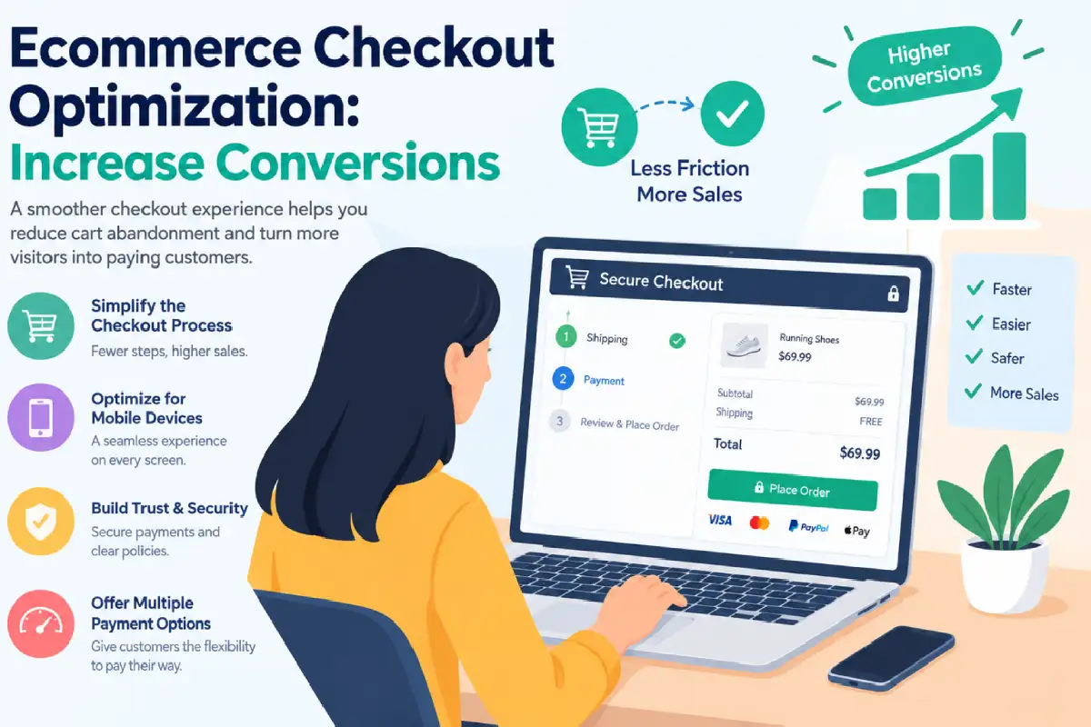
Ecommerce Checkout Optimization: Increase Conversions
Last Updated: September 15, 2026
Ecommerce checkout optimization Improving the final steps of the buying process is all about speeding up, streamlining and reassuring a customer through the ecommerce checkout. A hundred percent of customers can adore your product, pop it into their basket and leave empty handed due to a complicated checkout process, surprise charges or missing payment options.
Which puts checkout at a very high-value end of the spectrum for optimising conversion rates (CRs) in ecommerce. According to recent figures from Baymard, the average abandon rate for shopping carts is 70.22% 71.55%.
The best part is that most checkout issues can be solved without adding traffic. Here we cover how to improve the checkout, what to prioritize in testing, and which changes are most effective at increasing conversion.
What is a High-Converting Ecommerce Checkout?
A high-converting checkout does not necessarily have the fewest screens. It has the least perceived effort.
Baymard’s research found that the average checkout contains 19.9 form elements, while an optimized flow can be significantly leaner. Its research also emphasizes that reducing unnecessary fields can matter more than simply reducing the number of checkout steps.
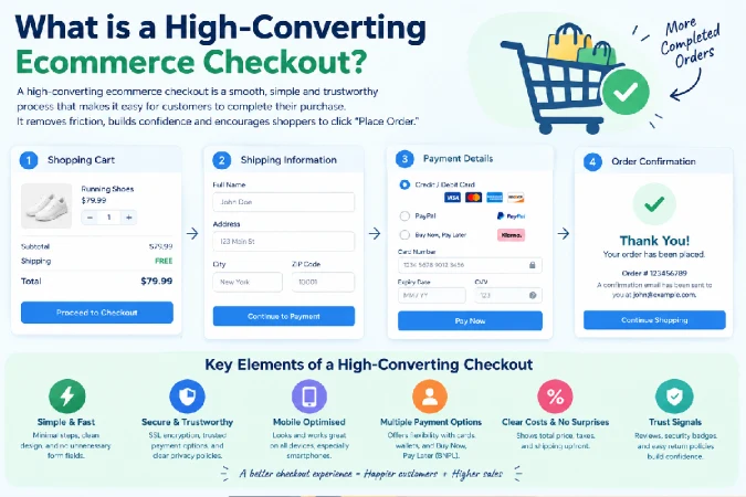
A strong ecommerce checkout should include:
- Clear order summary and total price
- Guest checkout
- Minimal required form fields
- Address autofill
- Mobile-friendly input fields
- Multiple relevant payment options
- Clear shipping and delivery information
- Visible returns and refund information
- Specific, easy-to-fix error messages
- A prominent final purchase CTA
- Trust and security signals
2026 checkout friction data
| Checkout problem | Shoppers abandoning |
| Not ready to buy/browsing | 43% |
| Extra costs too high | 39% |
| Delivery too slow | 21% |
| Didn’t trust the site with card details | 19% |
| Forced account creation | 19% |
| Checkout too long/complicated | 18% |
| Website errors/crashes | 15% |
| Total cost wasn’t visible | 14% |
| Preferred payment unavailable | 10% |
Source: Baymard research summarized in Shopify’s 2026 checkout research.
Simple takeaway: don’t optimize checkout based on assumptions. Use analytics, session recordings, customer feedback, and A/B testing to identify where your customers actually struggle.
Guest Checkout vs Account Creation
Forcing shoppers to create an account before purchasing adds friction at precisely the wrong moment.
Baymard reports that 19% of shoppers abandon because they are required to create an account, while 62% of ecommerce sites fail to make guest checkout sufficiently prominent.
The better approach is to make Guest Checkout the obvious option.
Instead of:
Sign in → Create account → Checkout
use:
Checkout as Guest | Sign In
You can offer account creation after the purchase. The customer has already completed the important work, so creating a password becomes a much smaller commitment.
Guest checkout vs account creation
| Approach | Conversion impact | Best use |
| Forced account | High friction | Avoid |
| Optional account before checkout | Moderate friction | Returning customers |
| Prominent guest checkout | Low friction | Most stores |
| Account creation after purchase | Very low friction | Best for encouraging registration |
If repeat purchases are important, explain the benefit of creating an account without making registration a condition of purchase.
How to Reduce Ecommerce Checkout Steps
Streamlining the checkout time seems to be a relatively easily task, however, user experience is not just about reducing steps.
Baymard‘s research suggested the average checkout was about 5.1 steps and 11.3 form fields in its 2024 benchmark. More recent research continues to focus on perceived effort and extraneous form fields rather than blindly pushing every checkout onto a single page.
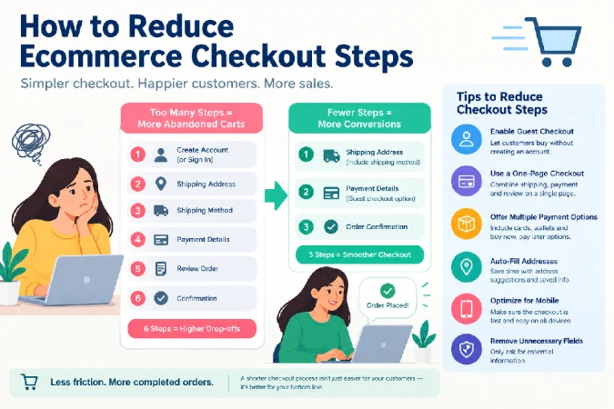
Start by removing information you don’t actually need.
Keep these fields
- Full name
- Shipping address
- Phone, when necessary
- Payment information
Question these fields
- Company name
- Address Line 2
- Separate first and last-name fields
- Re-enter email
- Optional marketing information
- Unnecessary demographic questions
Use browser autofill, address lookup, saved customer details, and an automatically selected “Billing address same as shipping” option.
A one-page checkout can work extremely well, but don’t assume it will outperform a carefully designed multi-step checkout. BigCommerce cites a case where moving from a three-page to one-page checkout produced a 37% conversion increase, but this is a case study—not a universal benchmark.
The rule: test the experience, not the trend.
Payment Options and Checkout Conversion Rates
Payment flexibility can remove a major conversion barrier.
Baymard reports that 10% of shoppers abandon checkout because their preferred payment method isn’t available.
Your payment mix should reflect your customers rather than simply copying another ecommerce store.
| Store audience | Payment options to consider |
| US customers | Cards, PayPal, Apple Pay, Google Pay, BNPL |
| UK/EU | Cards, PayPal, wallets, local payment methods |
| Indian ecommerce | UPI, cards, wallets, net banking, COD where appropriate |
| B2B ecommerce | Cards, bank transfer, invoicing, purchase orders |
| Global store | Cards, wallets and important local methods |
For Indian ecommerce, for example, hiding UPI behind several clicks can create unnecessary friction. The payment method should be visible, understandable, and easy to complete on mobile.
Also show accepted payment methods before the shopper reaches the final payment screen when possible.
Don’t overwhelm shoppers
More payment methods are not automatically better.
Prioritize the methods your customers actually use. Put the most relevant option first and make payment errors specific.
Instead of:
Payment failed.
show:
Your card was declined. Check the card number or try another payment method.
That gives the shopper a recovery path instead of a dead end.
How to Test and Improve Your Ecommerce Checkout
Checkout optimization should be an ongoing CRO process—not a redesign you perform once.
Start with your checkout funnel in Google Analytics or your analytics platform.
Track:
- Cart viewed
- Checkout started
- Shipping information completed
- Payment started
- Purchase completed
Then calculate:
Checkout completion rate = Completed purchases ÷ Checkout starts × 100
For example, if 1,000 shoppers start checkout’s and 300 complete their purchases:
300 ÷ 1,000 × 100 = 30% checkout completion rate
What should you A/B test?
Prioritize tests based on customer evidence.
Test 1: Guest checkout prominence
Test 2: Fewer form fields
Test 3: One-page vs multi-step checkout
Test 4: Express payment buttons
Test 5: Shipping-cost transparency
Test 6: Different CTA wording
Test 7: Payment-method ordering
Test 8: Mobile form layout
Do not change five major elements simultaneously. If conversion improves, you won’t know which change caused it.
A better testing process is:
Identify the friction→ hypothesise→ run an A/B split test→ monitor conversion rate→ check for revenue or average order value→ implement the best solution.
Stripe asserts that merchants who do so are able to reap “precise, tangible business benefits including uplift in revenue from optimized checkouts.” This supports that view that viewing checkout as a conversion system rather than a design page.
Ecommerce Checkout Troubleshooting Checklist
If your checkout conversion rate suddenly falls, check these issues first:
Checkout works on desktop but not mobile
Test the entire purchase process on real phones. Check button sizes, keyboard behavior, autofill, sticky CTAs, page speed, and payment redirects.
Customers abandon after seeing shipping
Show shipping costs or realistic estimates earlier. Unexpected additional costs are one of the biggest abandonment triggers.
Payment failures are increasing
Segment failures by payment method, device, country, bank, and error code. A UX problem and a payment-processing problem require different fixes.
Customers aren’t using guest checkout
Move the guest option above account creation and use explicit wording such as “Checkout as Guest.” Baymard specifically recommends making the option visually prominent.
Checkout traffic is high but purchases are low
Don’t immediately redesign the whole page. Compare checkout-start and purchase-completion rates, inspect recordings, review error logs, and survey abandoned customers.
Ecommerce Checkout Optimization: The 2026 Priority List
If you can only make five improvements, start here:
| Priority | Optimization | Why it matters |
| 1 | Show total costs early | Removes price shock |
| 2 | Offer prominent guest checkout | Removes forced-registration friction |
| 3 | Reduce unnecessary fields | Makes checkout easier |
| 4 | Add relevant payment methods | Gives customers payment choice |
| 5 | Optimize mobile checkout | Captures mobile purchase intent |
The biggest lesson from current ecommerce UX research is that checkout optimization is about reducing uncertainty and effort—not simply making a page shorter.
A fast checkout’s still needs to answer the shopper’s questions: What am I paying? When will it arrive? Can I trust this store? Can I use my preferred payment method? What happens if something goes wrong?
Answer those questions clearly, remove unnecessary work, and continually test the experience.
Frequently Asked Questions
What is ecommerce checkout optimization?
Ecommerce checkout’s optimization is the process of improving the checkout experience to reduce friction, prevent abandonment, and increase completed purchases.
How can I increase my checkout conversion rate?
Start by offering guest checkout, reducing unnecessary form fields, showing costs upfront, improving mobile UX, adding relevant payment methods, and testing each major change.
Is one-page checkout better?
Not necessarily. One-page checkout’s can reduce navigation and page loads, but the number of steps alone isn’t the most important factor. Form complexity and perceived effort also matter.
Should ecommerce stores require account creation?
Usually, no. Make guest checkout’s prominent and offer account creation after the purchase. Forced registration is a documented source of checkout abandonment.
How many payment methods should an ecommerce store offer?
There is no universal number. Offer the payment methods your target customers actually use, with priority given to popular local options, cards, wallets, and relevant alternative payments.
How do I know whether checkout optimization is working?
Monitor checkout-start-to-purchase conversion, abandonment at each step, payment failures, revenue per visitor, average order value, and device-level performance. Always compare changes against a baseline or controlled test.
Bottom line:
The most valuable ecommerce checkout changes are often lower-value without a fancy new look. They are the incremental lowering of the friction of uncertainty, typing, waiting, and choice: those things that help a customer who is ready to buy complete their order.