

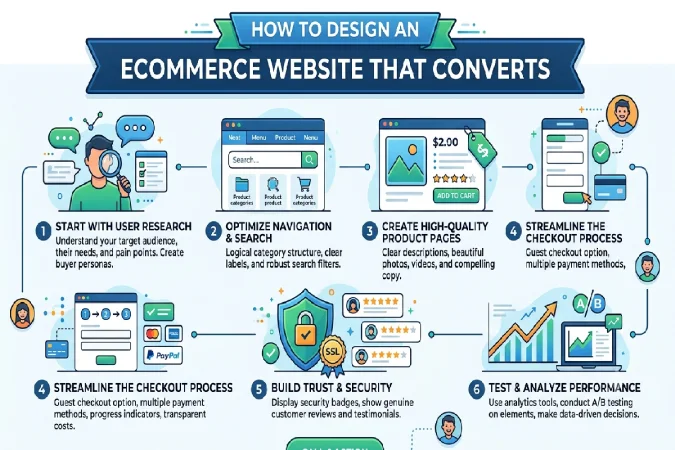
How to Design an Ecommerce Website That Converts
Last Updated: September 10, 2026
Website Design. An ecommerce website is not just an online shopping catalog. It is the digital equivalent of a shop window where visitors make the assessment whether they want to buy from you or not. Attractive appearance will not guarantee a successful sales if users cannot easily find products, easily figure out pricing, browse discreetly and quickly, or quickly progress through the checkout.
A design-driven ecommerce website offers the combination of all the essential factors for building an effective retail site, including high quality design, user-friendly navigation, convincing product messaging, mobile responsiveness, speedy performance, and positive signals of trust.
Whether you are creating a new ecommerce site or redesigning an existing one, following these ecommerce website design best practices will not only help your customers have a better shopping experience but also help you increase conversions.
How to Plan an Ecommerce Website Layout
Define the structure of the web site before selecting colors, fonts, images and animations. Use such schems that represent prospective/actual customer‘s way of shopping.
A simple ecommerce structure might be:
Homepage → Category Page → Product Page → Cart → Checkout
You can also include supporting pages such as:
- About Us
- Contact Us
- FAQs
- Shipping Information
- Returns and Refunds
- Privacy Policy
- Terms and Conditions
- Customer Reviews
- Blog or Buying Guides
Keep Navigation Simple
Your navigation should help customers find what they need without making them think too much.
For example, an online clothing store might use:
Women | Men | Kids | Shoes | Accessories | Sale
Avoid complicated category names that customers may not immediately understand.
For stores with hundreds or thousands of products, add a prominent search bar, filters, and sorting options. Customers should be able to narrow their choices by attributes such as price, size, color, brand, rating, or product type.
Create a Clear Visual Hierarchy
Not every element on a page should compete for attention. Use size, spacing, typography, and positioning to establish priorities.
A typical product page hierarchy might be:
Product image → Product name → Rating → Price → Key benefits → Options → Add to Cart → Detailed information
This helps visitors process information in a logical order.
Design Around the Customer Journey
Every page should have a purpose.
Your homepage introduces the brand and directs visitors toward products. Category pages help shoppers compare options. Product pages provide information and encourage purchase. The cart summarizes the order, while checkout makes completing the transaction as easy as possible.
Ecommerce Homepage Design Best Practices
Your homepage often creates the first impression of your ecommerce business. It should immediately communicate what you sell, who it is for, and why customers should care.
https://www.sba.gov/?utm_source=chatgpt.com
1. Create a Strong Hero Section
The hero section is usually the first major visual area customers see.
Include:
- A concise headline
- Supporting text
- Relevant product imagery
- A clear call-to-action
- A genuine offer or promotion, if applicable
Instead of writing:
“Welcome to Our Online Store”
use a benefit-focused message such as:
“Everyday Skincare Designed for Sensitive Skin”
And a CTA like Shop Skincare.
2. Showcase Best-Selling Products
Utilize the homepage to promote products likely to be bought by customers;
You could create sections for:
- Best sellers
- New arrivals
- Trending products
- Seasonal collections
- Limited collections
- Special offers
Each product card should make essential information immediately visible, including the product image, name, price, and rating where appropriate.
3. Communicate Your Unique Value
Give visitors a reason to choose your store.
For example:
Free Shipping | Easy Returns | Secure Payments | Customer Support
Only promote benefits that your business actually provides.
4. Include Social Proof
Customer reviews and testimonials can reduce uncertainty, particularly when visitors are unfamiliar with your brand.
Consider displaying:
- Product ratings
- Written reviews
- Customer photos
- Testimonials
- Number of customers or orders, when accurate
Authentic social proof is far more valuable than exaggerated claims.
How to Design Effective Product and Category Pages
Product & Category pages are very important because that is when the customer determines whether a product is a worthwhile purchase
Product Page Design
It has a strong, information-rich product page capable of persuading the customer to purchase.
Use High-Quality Product Images
Product pictures need be clearly showing, uniformed and pertinent.
Provide views of the product from multiple angles wherever possible; close-up views, lifestyle photographs, size references and/or videos would be acceptable.
For example, an apparel product page could include:
- Front view
- Back view
- Close-up of fabric
- Lifestyle image
- Size or fit reference
Write Useful Product Descriptions
Avoid relying on vague descriptions such as “high quality” or “premium product.”
Explain:
- What the product does
- Who it is designed for
- Main features
- Customer benefits
- Materials or ingredients
- Dimensions
- Available sizes
- Available colors
- Usage instructions
- Care instructions
- Warranty information where applicable
Focus on answering the questions customers are likely to have before purchasing.
Make Pricing Obvious
Customers should not have to search for the price.
If you offer a genuine discount, clearly display the current price and relevant savings. Avoid creating artificial urgency or misleading discount claims.
Make the CTA Prominent
The Add to Cart button should be easy to identify.
Use clear calls to action such as:
Add to Cart
Buy Now
Choose Your Size
The appropriate CTA depends on your store’s purchasing flow.
Add Reviews and FAQs
Reviews can help customers understand real-world experiences. FAQs can address common concerns about sizing, shipping, returns, compatibility, materials, or usage.
Category Page Design Best Practices
Category pages should make product discovery and comparison easy.
A useful category page typically includes:
- Clear category heading
- Short introductory text
- Product grid
- Filters
- Sorting options
- Breadcrumbs
- Pagination or suitable loading behavior
Avoid excessive introductory content that pushes products too far down the page.
Filters should be relevant to the category. For example, an electronics store may use filters for brand, price, storage, screen size, and features, while a fashion store may use size, color, material, brand, and price.
Mobile Ecommerce Website Design Best Practices
A large portion of ecommerce browsing happens on smartphones, making mobile design essential.
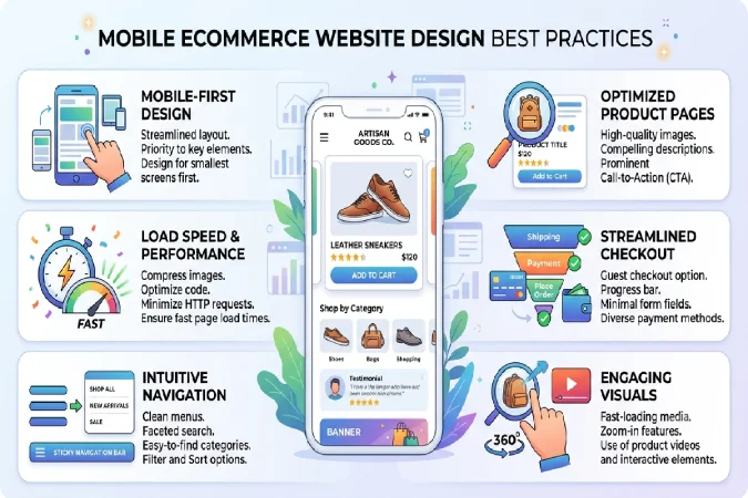
A website should provide the same core functionality on mobile that customers expect on desktop.
Use Responsive Design
Your website should automatically adapt to different screen sizes.
Check that:
- Text remains readable
- Images display correctly
- Menus work properly
- Buttons are easy to tap
- Product grids don’t become cramped
- Forms are easy to complete
Make Mobile Navigation Easy
Use a simple mobile menu and keep search easily accessible.
Customers should not be put through several screens before coming to the product needed.
Optimize Page Speed
Larger images, too many scripts, unnecessary plugins, complex animations can also slow down your website.
Use compression, eliminate unused space/parts, and adopt best practices/technologies.
A faster site offers a better experience for users and can enable a better search presence.
Simplify Mobile Checkout
Checkout should be as straightforward as possible.
Avoid unnecessary fields and make it easy for customers to:
- Review their cart
- Enter shipping information
- Select payment methods
- See delivery costs
- Apply discounts
- Correct mistakes
- Complete payment
Clearly communicate the final order total before purchase.
Ecommerce Design Mistakes That Hurt Conversions
Poor usability can cost sales even on a beautifully designed website.
1. Cluttered Homepage
Excessive banners, pop-up windows, product shelves, and other promotional messages can be confusing.
Solution: Clearly define a visual hierarchy and direct user‘s attention to the key elements.
2. Complicated Navigation
If customers are unable to find what they are after quickly they may leave.
Answer: Categories, search, filters, breadcrumbs.
3. Poor Product Photography
Selling a product that is hard to see, doesn‘t look the same in the end as on the website, or doesn‘t have enough visual information to make a choice can make customers feel uneasy.
Solution: Buy multiple, simple, easy-to-understand images of your products.
4. Weak Product Descriptions
A product page that provides little useful information forces customers to search elsewhere.
Solution: Answer common buying questions and explain benefits as well as features.
5. Hidden Shipping Costs
The unanticipated cost displaying during the checkout is responsible for 15% of the abandoned shopping carts.
Solution: Make shipping charges, likely time frames and conditions known when ever reasonably possible.
6. Too Many Pop-Ups
Pop-ups are good for promotion or email signup, but you get annoyed with too many interruptions.
Solution: Use flaps selectively and keep them simple to close.
7. Poor Mobile Experience
Awkward buttons, slow pages, tricky menus, painful forms the other thing that can drive your smartphone consumers away.
Solution: Sip through the entire shopping process on mobile phones.
8. Weak Calls to Action
Customers may walk away if they are unclear as to what to do next
Solution: Keep the Call to Action (CTA) simple, clear, and action-oriented; provide specific instructions for the user to follow.
9. Lack of Trust Signals
Customers might be discouraged when they cannot quickly locate information about returns, shipping, payments, customer service, etc
Solution: Make key policies and customer service information visible.
How to Build an Ecommerce Website That Converts
A good ecommerce website is not just a pretty face. It is about usability, selling messages, reliability, fast, mobile-friendly, hassle-free buying.
Begin your website design by prioritizing your customers’ needs. Develop your homepage to showcase your value proposition and make it clear what you offer. Allow users to navigate easily through category pages and fully inform themselves on product pages.
Then improve the mobile experience and make the checkout process straightforward.
Lastly, track analytics to see where visitors exit the website. Focus on conversion rate, product-page activity, cart-abandonment rate, checkout-rate, average order size and mobile.
Test everything, Remember that your ecommerce design is always evolving. Experiment with different layouts, calls to action, product displays and navigation features, to see what appeals most to your visitors.
The bottom line for ecommerce website design is simple: it‘s just about getting the customer to the product, helping them understand it, convincing them they can trust the product and your business, and finally closing the sale.